How to Test a YouTube Thumbnail Before You Publish
By TubeScope Editorial Team · 2026-08-31 · 8 min read
Your thumbnail decides whether anyone ever sees your video. YouTube shows it to people, people click or scroll past, and that click-through rate feeds straight back into how much more YouTube shows it. Yet most creators design a thumbnail at full size, stare at it alone on a big screen, upload, and hope. This guide shows how to actually test one before publishing — using the free TubeScope Thumbnail Tester, and honest reasoning about what testing can and can't tell you.
First, the uncomfortable truth
No tool, human, or AI can tell you in advance that a thumbnail will get clicks — not even YouTube. The only real verdict is CTR after publishing (and YouTube's built-in "Test & Compare" A/B feature is the final word once the video is live). What testing before publishing does is catch the avoidable failures: text nobody can read, a tile that melts into dark mode, a design identical to every competitor, faces hidden under interface elements. Those problems are fixable in five minutes before upload — and invisible until you look for them.
Test 1: The size reality check
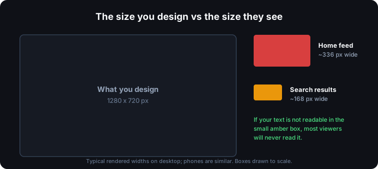
You design at 1280×720. Viewers mostly meet your thumbnail at around 336px wide on the home feed and 168px in search — a few percent of the area you worked on. Detail that looks great at full size turns to mush. The tester's squint test renders your image at those exact sizes with an optional blur: if the message survives 168px, it survives anywhere. If you can't read your own text there, neither can anyone else.
Test 2: The feed test — your thumbnail among real competitors
A thumbnail is never seen alone. It sits in a grid, fighting a dozen other tiles for one glance. So the single most useful test is seeing it in that grid — and this is what makes the TubeScope tester different: type the search term you're competing for, and it pulls the videos actually ranking on YouTube for that term right now and places your thumbnail and title among them.
Then interrogate it honestly:
- Flip between light and dark mode. Most heavy YouTube users browse in dark mode, where a dark-background thumbnail can lose its edges and melt into the page. A design that pops in light mode can vanish in dark.
- Check desktop, home grid, and mobile layouts. Search shows you small and wide; mobile shows you big; the home grid is in between.
- Shuffle your position and turn off the highlight. Then honestly ask: where does your eye land first? If it's not on yours, the feed just told you something.
- Load a B version. Two candidates in the same feed settles arguments faster than any opinion.
Test 3: Safe areas — where YouTube draws over your image
YouTube paints its own interface on top of your thumbnail: the duration badge always covers the bottom-right corner, a red watch-progress bar runs along the bottom edge for anyone who already started your video, and on desktop hover the Watch Later and queue buttons appear top-right. Text, logos, or faces in those zones get covered. The tester overlays realistic mocks of all three on your image so you see exactly what survives.
Test 4: What the pixel measurements mean
The tester computes a few things from your actual pixels — all in your browser; the image never leaves your device:
- Brightness. A very dark average is a caution flag: dark tiles carry less visual weight in a bright feed and can merge with YouTube's dark mode background. It is not a verdict — dark backgrounds with strong bright elements are a legitimate style — but if you get this flag, check the dark-mode feed view before shrugging it off.
- Contrast. The spread between your darkest and brightest areas. Low contrast is what makes thumbnails look muddy at small sizes.
- Visual clutter. Edge density — how much fine detail you packed in. Busy images become noise at 168px.
- Saturation. Muted palettes read as background; vivid ones read as content. Neither extreme is automatically right, but it's worth knowing where you sit.
Test 5: The stand-out score — are you camouflaged?
Every thumbnail guide says "look at the search results and be different." The tester turns that advice into a measurement: it reads the dominant colors of the thumbnails currently ranking for your topic and compares them with yours. Score under 30 and you're camouflaged — same palette as everyone around you. Over 55 and you visibly break from the feed.
One honest caveat: the score measures difference, not beauty. A hideous neon thumbnail would also score high. Use it to detect camouflage, then let your eye — in the feed test — judge whether your difference is attractive.
A five-minute pre-publish routine
- Export your thumbnail (1280×720, under 2MB) and drop it into the tester.
- Type your real title and the search term you want to rank for, and load the real competitors.
- Dark mode, shuffle, highlight off: does your eye find you?
- Squint test at 168px: does the message survive?
- Fix what failed — usually bigger text, fewer elements, or a color shift away from the feed — and re-test. Then publish, and let real CTR (and YouTube's own A/B test) have the final word.
Study what already wins while you're at it: grab the top-ranking thumbnails in your niche with the Thumbnail Downloader, and pressure-test your title with the AI Title Rewriter — the thumbnail and title get clicked (or skipped) as one unit.
Frequently asked questions
Can I test a thumbnail without publishing the video?
Yes — that's the point of a pre-publish tester. Upload the image file to a tool like the TubeScope Thumbnail Tester, and it simulates how the thumbnail looks in YouTube's feed layouts, at real feed sizes, in light and dark mode, next to the videos currently ranking for your topic. Nothing is uploaded to YouTube and the image never leaves your browser.
What size do viewers actually see thumbnails at?
Far smaller than you design them: roughly 336 pixels wide on the desktop home feed and about 168 pixels in search results — phones are similar. That's why text that looks fine on your editing canvas is often unreadable in the wild.
Does a dark thumbnail hurt clicks?
Not automatically — dark backgrounds with strong bright elements are a deliberate style that works for many channels. The real risk is dark mode: YouTube's dark interface is near-black, so a dark-background thumbnail can lose its edges and melt into the page. Always check the dark-mode feed view before publishing a dark design.
What's the best way to A/B test thumbnails?
Before publishing, place two candidates in the same simulated feed and see which one pulls your eye. After publishing, use YouTube's built-in Test & Compare feature, which shows different thumbnails to real viewers and measures actual watch share — that's the definitive test.
Try it yourself: Thumbnail Tester · Thumbnail Downloader · AI Title Rewriter